Ever wondered why some spaces instantly relax you, while others energise or even irritate? The secret might lie in the colour! Karen Haller, is an expert in applied colour psychology, and reveals how understanding the emotional dance of colours can transform our built environments into havens of well-being and productivity. Whether you're an interior designer, architect, or simply a lover of nature-inspired spaces, this podcast dives deep into the unseen forces of colour.
You’ll learn how colour influences behaviour, how to select the perfect hues for different environments, and why true biophilic design demands more than green and brown, it's about the symphony of natural colours that heal and energise us.

Colour Psychology seems to be a bit of a missing link in biophilic Design. Not a lot of people are talking about it but it is vitally important. We’ve all seen it—spaces drenched in beige, sterile white corridors, or overly vibrant hues that overpower instead of soothe. Spaces, especially healthcare environments, often neglect the impact colour can have on users of the space.
Karen shatters the myth of “neutral” colours being emotionally neutral altogether. Every colour triggers a response, whether it is positive or negative, each is embedded in our personal memories, cultural beliefs, and innate responses. For example, red energises or stimulates physical reactions, but excess can overwhelm. Blue can be calming or stimulating, depending on its shade and context. Recognising this nuanced language of colours allows designers to craft environments that truly support human health and behaviour. Whether it's selecting hues for a hospital or designing a peaceful workspace, understanding the emotional implications of colour creates spaces that nurture rather than numb.

3 ways we relate to Colour – and how to use them!
Karen’s theory identifies three distinct ways we connect with colour:
Personal Associations:
Colours evoke memories and feelings unique to each individual. A bright yellow might remind someone of their childhood joy or a dull green might trigger childhood discomfort. These associations drive our preferences and aversions—so understanding clients’ personal ties to colours is key.
Cultural Meanings:
Deep-rooted beliefs shape cultural responses—red for luck in China, white as a symbol of death elsewhere. Ignoring these can cause disconnect in design choices for diverse spaces.
Colour Psychology:
Each hue has a spectrum of responses aligned with nature’s endless diversity.
Recognising these layers allows designers to create intentionally harmonious spaces—be it a calming hospital room or an energetic collaborative zone.
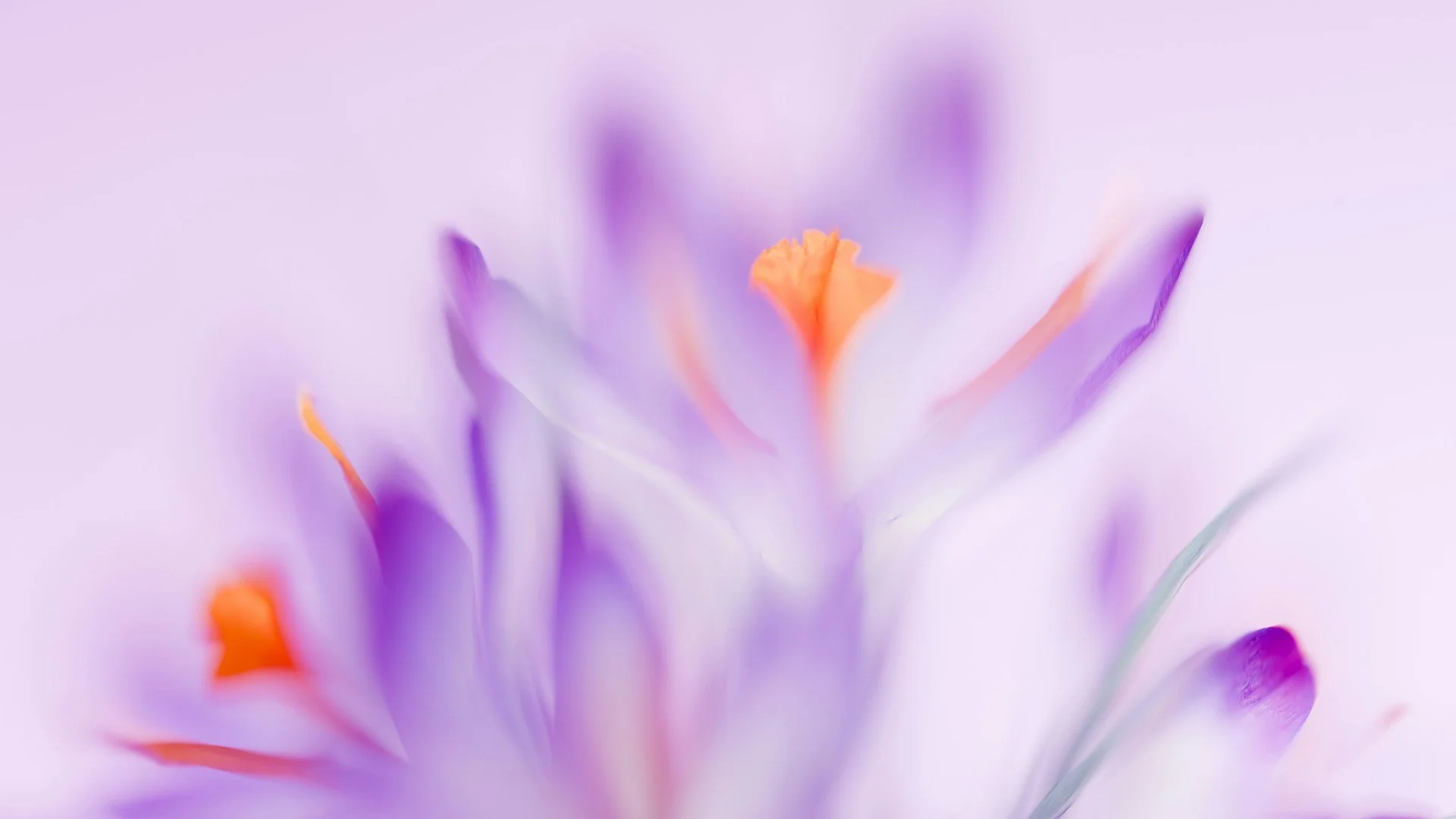
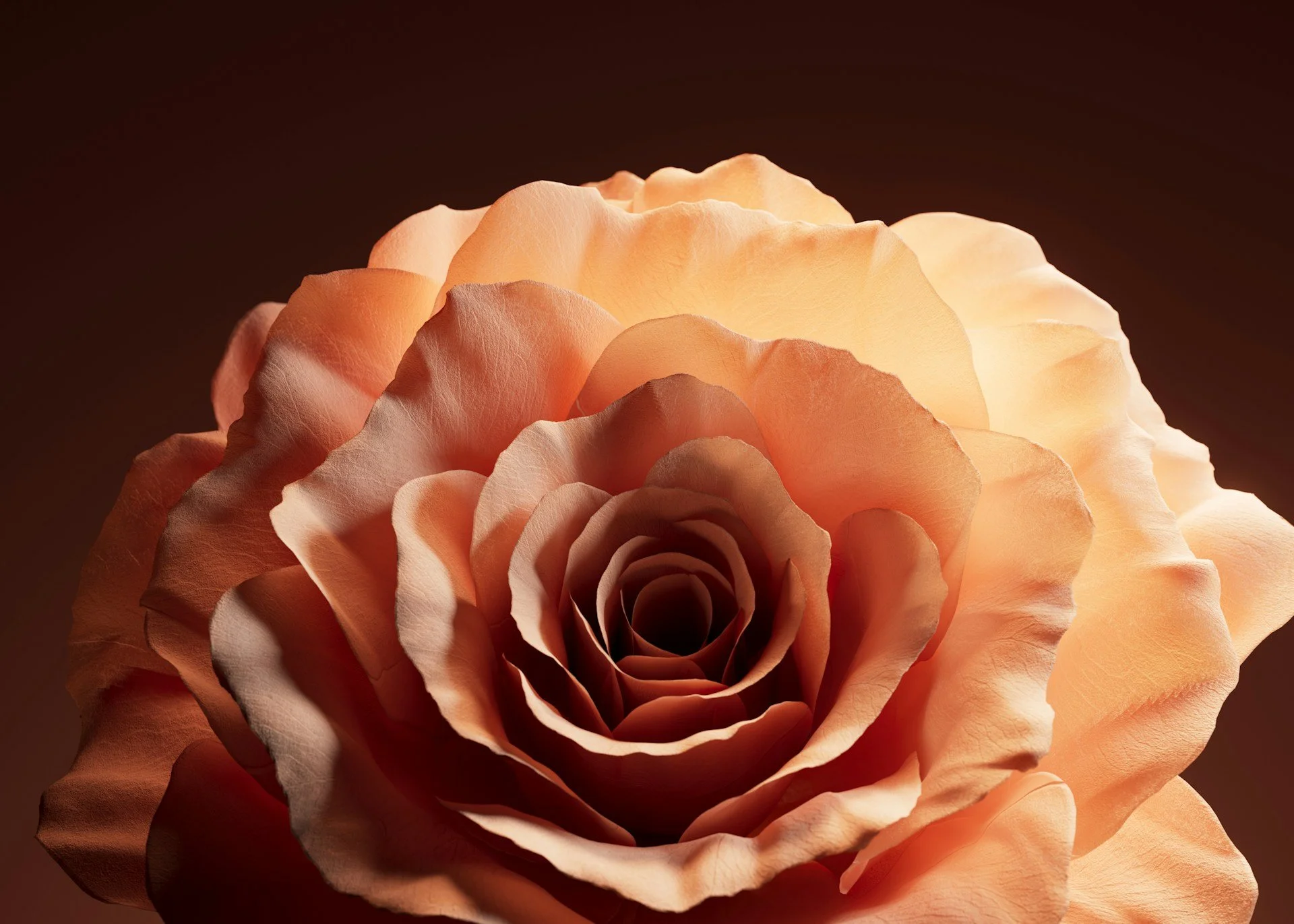
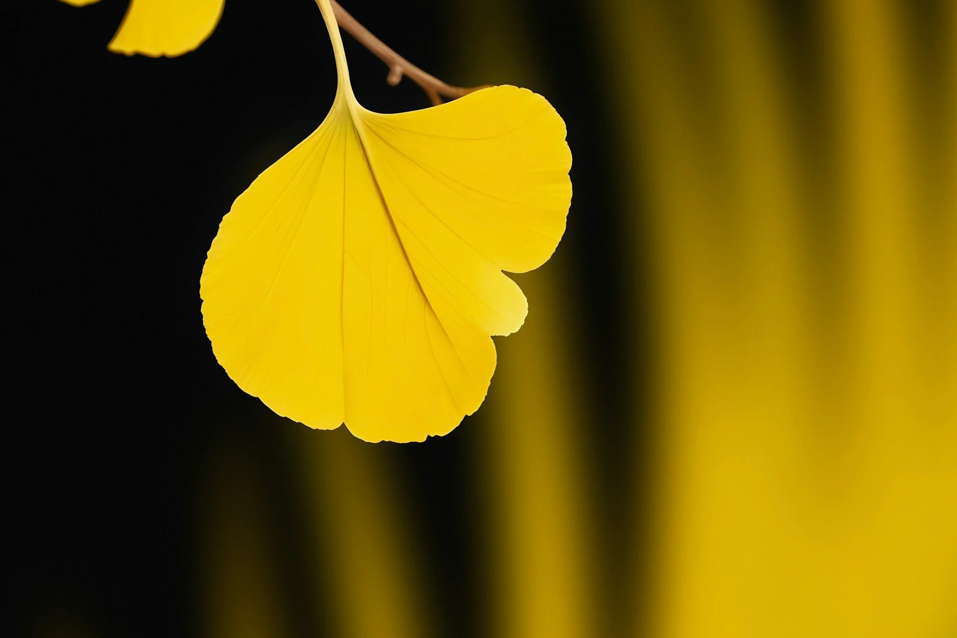
Nature's palette can guide authentic Biophilic Design
Nature’s colours can be perceived almost like a blueprint for emotional well-being. Karen emphasises the importance of looking to true nature, not what humans have altered or manufactured, as the starting point for colour in biophilic design. Every colour that appears naturally in nature is biophilic by the very fact that it’s natural. The key is understanding how those colours work together, how they create harmony, and how they support the desired behaviour and emotional outcome for the people using the space.
Nature’s colours can be perceived almost like a blueprint for emotional well-being. When designing with nature in mind, start by identifying the desired outcome, calm, energy, focus, and work backwards from the behaviours you want to support. From there, select colours drawn from true nature that align with that outcome.
For a high energy space such as a fast-paced meeting or scrum room, colours that support movement, pace and activity can be introduced with care and in the right proportion. In contrast, spaces that require focus or restoration call for very different combinations, where balance, harmony and the specific qualities of each colour become critical.
Avoid the cliché of “green and brown”, these are just two colours among many. True biophilic design draws from the full range of natural colour, and more importantly, how those colours work together. It’s the relationship between the nuance of colours, their balance and harmony, that creates an environment that supports people wellbeing.

Good biophilic design comes complete with a understanding of emotional language of colours.
Genuine biophilic design is rooted in understanding this language, aligning space with human innate responses, and collaborating across disciplines.
Whether it’s a hospital, office, or school, the goal is harmony, balancing energy levels, fostering comfort, encouraging productivity. This is achieved by starting from the outcomes and working backwards, what behaviours must be supported? What emotions should be evoked? Then, select colours accordingly. Remember, every space is an ecosystem, and our role is to nurture human-nature connection through thoughtful colour choices, never just following trends but listening to what nature and our psychology say.


When you understand the true language of colour, you wield a tool you can use to shape environments that heal, energise, and sustain us. Dive deeper with Karen Haller’s courses or consult her for tailored strategies. Start viewing spaces as living ecosystems filled with the colours of nature, inspired by human psychology, and crafted for well-being. Because colour can also help restore our innate connection to the natural world.
To find out more about Karen please connect with her:
Instagram: https://www.instagram.com/karen_haller_colour
Facebook: https://www.facebook.com/KarenHallerColourAndDesign
LinkedIn: https://www.linkedin.com/in/karenhaller
Consulting https://karenhaller.com
Free design industry e-book https://karenhaller.com/free-10-myths-ebook
Colour & Design courses https://karenhaller.com/courses
Little Book of Colour https://thelittlebookofcolour.com
Free first chapter https://thelittlebookofcolour.com/free-chapter
Have you got a copy of the Journal? You can now subscribe as a member of the Journal of Biophilic Design or purchase a gorgeous coffee table reference copy or PDF download of the Journal journalofbiophilicdesign.comor Amazon and Kindle.
Credits: with thanks to George Harvey Audio Production for the calming biophilic soundscape that backs all of our podcasts.
Listen to our podcast on Audible, Amazon Music, Spotify, iTunes, YouTube and all the RSS feeds.
https://www.facebook.com/journalofbiophilicdesign/
https://www.linkedin.com/company/journalofbiophilicdesign/
https://www.instagram.com/journalofbiophilicdesign
If you like this,please subscribe!